Shortly after attending the camp hosted by Adorned through Christ, I spoke to someone about the logo of the blog. I told her that I could not really explain to her WHY I drew it in the way I did or why I used the colors that I had used.
This past week, I was walking and thinking about the symbolic meaning behind the logo. It was on the back of my mind the whole time. While working, while the blog entry about the camp was being formulated in my mind, even while dealing with a personal matter, I was thinking about this logo.
Now I wonder – do other people also do it like this or is it only me?? Do other people also walk around with what feels like 10 million things on their minds while having to deal with life in general?
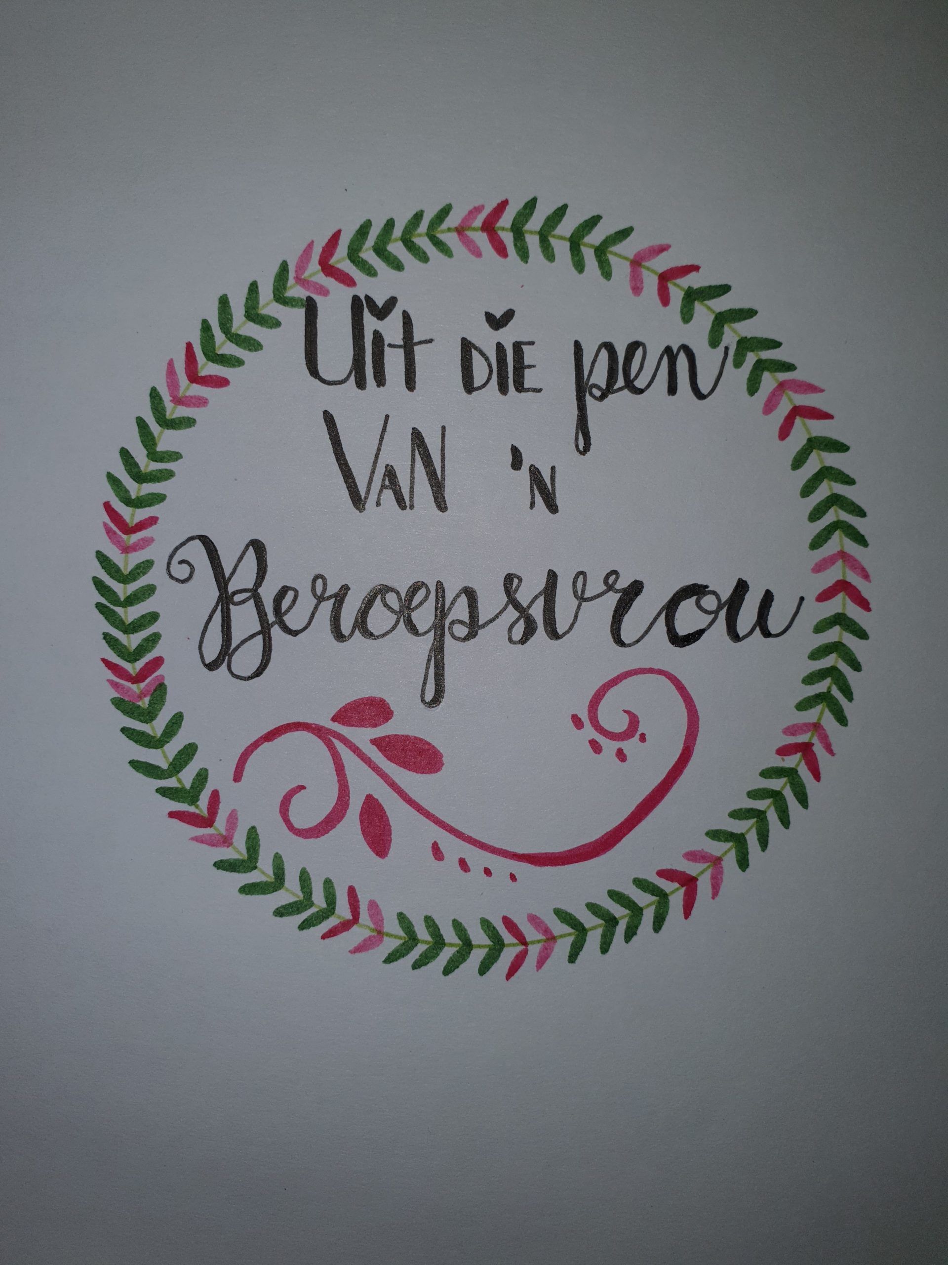
Anyway, back to the meaning…..the circle (wow for a moment I struggled to spell that, reverting to Afrikaans spelling….I had a good chuckle with myself now). So the circle represents Gods love. It has no beginning and no end. If not mistaken, this was the message that the pastor that married us, spoke about during our wedding ceremony 15 years ago. (We will be married for 15 years on 30 September).
The little leaves on the circle are also hearts if you look closely. I absolutely LOVE drawing hearts! Since I figured out how to make hearts with the Brush tip pens from Faber Castel I am obsessed with it! Everything has to have a heart in and all i’s have to have a heart instead of a normal boring dot….
The colors – the green symbolises life, like a tree getting new leaves. The pink symbolises being a woman. The hearts / leaves are on top of the circle, because we are in God and He is in us. You cannot see where they start or end. I hope this makes sense?
The writing and font is just how I like to journal at this stage. Some fancy lettering and others just less fancy and more ordinary. This symbolises each person being uniquely and beautifully created by God. We are all beautiful in our own way.
The little curl at the bottom of the words symbolises the beauty of life. I think I saw it somewhere on a bottle of body cream once and liked it. I like florals and the older I get the more I seem to take a liking to florals and floral like patterns.
I hope that I am not becoming a little old lady with my likings to florals increasing and now that I am 40! Long and short is, everything that we do, that is laid on our hearts, even if they do not make sense at the time, usually has a bigger meaning and God will reveal all when the time is right.
The logo will be transformed into electronic format and as soon as it is ready, I will introduce it to the readers…..I drew the logo in March already and only received the meaning of it in September. God is always terribly on time. Maybe I would not have understood the symbolic behind it as well as I do now? Or perhaps I would not have been able to translate it into words? Who knows?
Die Logo